Purple Design: Building an agentic design system
Everything used to be designed in Figma, then rebuilt from scratch in code. I built an agentic design system, so whoever is building now works straight from the source. Point Claude at our MCP and it builds with the real components.
At a glance
- to a prototype, down from weeks
- Hours
- successful MCP calls in the first month
- 2,000+
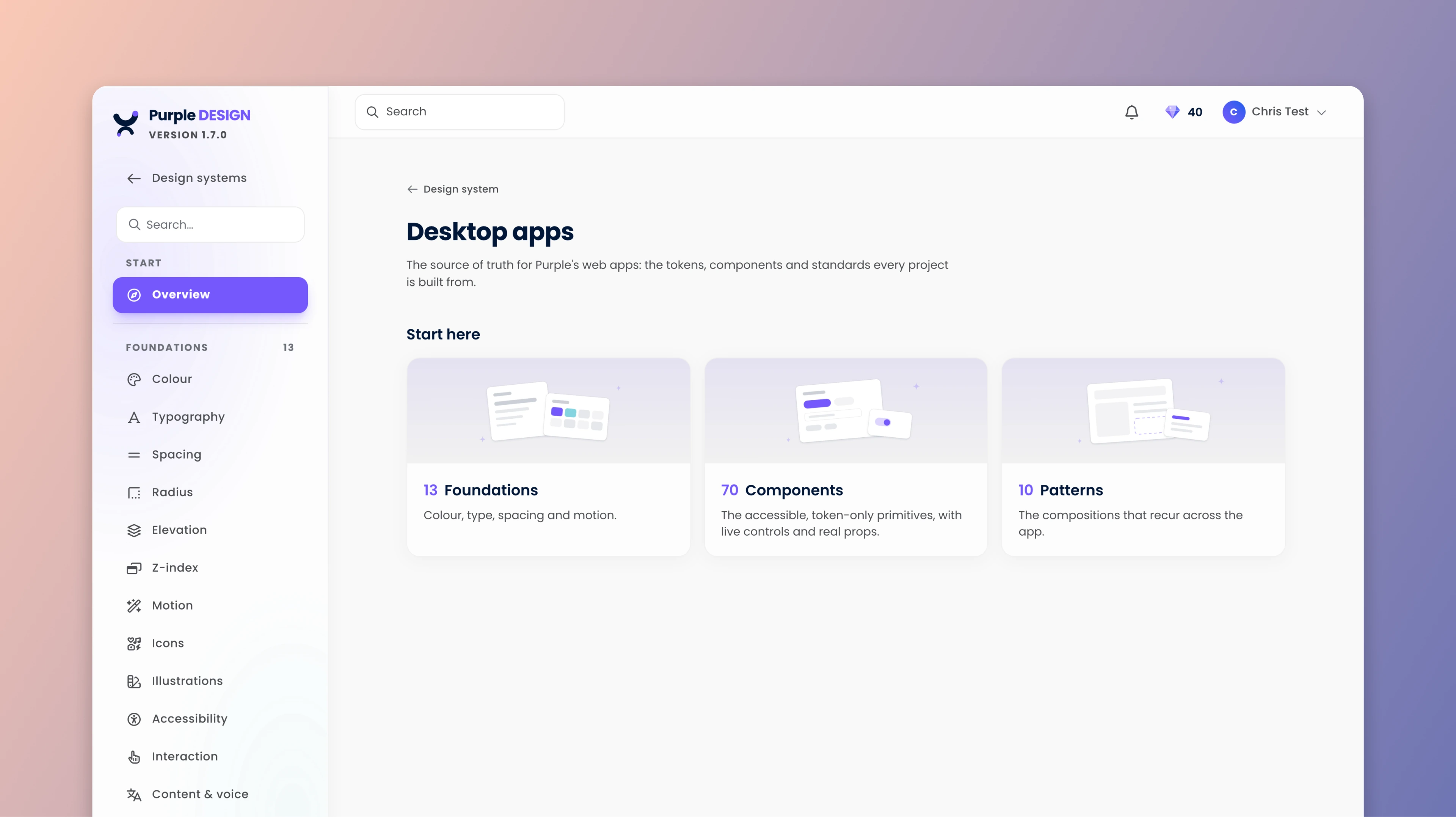
- components, over 13 foundations and 10 patterns
- 70
- tools exposed to AI clients, across three servers
- 48
- VP Design at Purple. I designed and built the system myself
- 70 web components, 10 mobile-native
- Product, marketing, customer service and design
The problem
Our designs and our prototypes were both made in Figma. Developers got them as walkthroughs and schematics, read the file, inspected the components and built from that. A basic prototype could take months.
It always came back slightly different. A developer is not reading a layout for the same details a designer is.
We did have a design system, but it lived in Figma, and the build happened in code.
Then everyone started prototyping
AI changed who makes prototypes. Product managers, marketing, customer service reps: people across the business started building interfaces, and all we could give them was the Figma library. Their tools read it however they liked.
What came back had the right colours, the right fonts, and components we had never made. Every prototype was a fresh interpretation, so no two matched. They all arrived at the design team for review, and we could lose days in a week to it.
| What is being compared |  The Figma system The Figma system |  Purple Design Purple Design |
|---|---|---|
| What the agent reads | A screenshot | The real packages, from GitHub |
| What decides the layout | The agent | Templates, and the rules in the manifest |
| Checked afterwards | No | Every build |
| What comes out | Inconsistent UI, every time | The right components, used the right way |
A site that documents itself
The documentation is a by-product of the build. Building the top navigation produced a top navigation component. Defining the type and the colour produced the foundations. Adding tiles, metrics and tools produced more components.
It sorts into three tiers. Foundations are colour, typography, spacing, elevation, motion, icons, illustrations and the tokens. Components are the pieces: buttons, app bars, cards, fields, modals, line charts, 70 in all. Patterns bring those together into something whole, like a calendar or a sign-in page. Desktop came first, mobile followed.
I wanted full control over the system: a website that documents itself, which I could then expose to AI agents.
The library
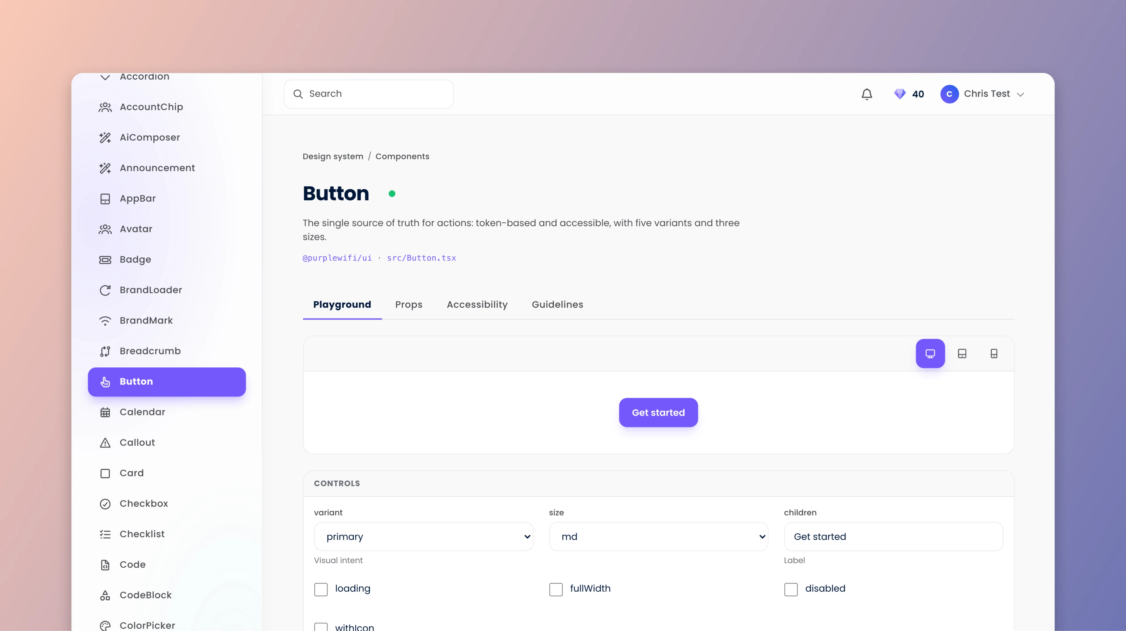
Every foundation, component and pattern gets its own page, and showing the thing is not enough. The button page is a playground: every variant, every size, loading, disabled, with an icon and without. Beside it sits the code you would write, the props, an automated accessibility pass documented against WCAG 2.2, and guidelines for where the button belongs and where it does not. Then a link to the package, so you can go and use it.
Tokens
One token package feeds everything. Colour, type, spacing and motion are defined once, and nothing downstream keeps its own copy, so there is no second version to drift from. When an agent builds a screen it inherits the real values rather than picking something close.
Templates
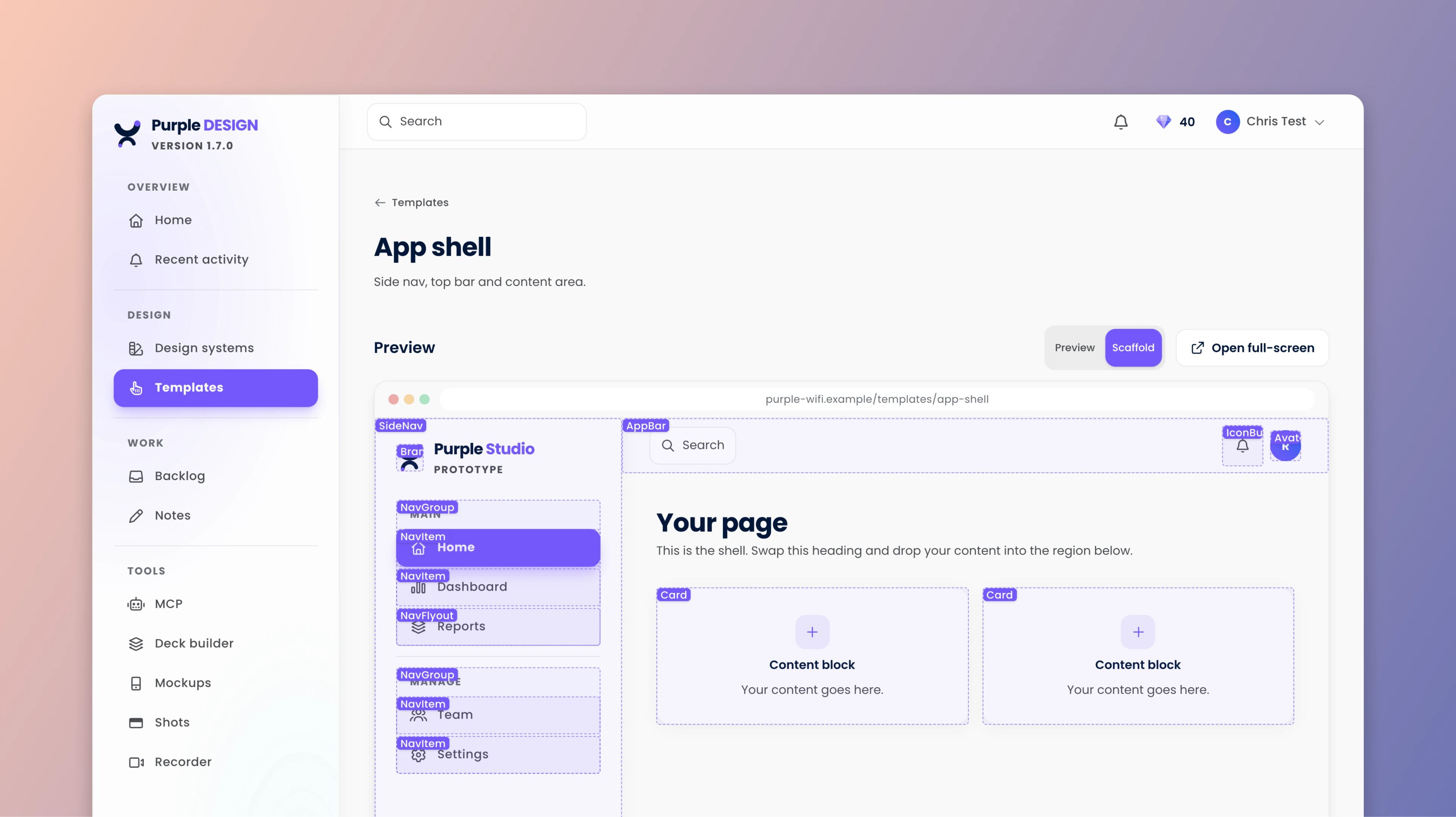
A correct component in the wrong place still makes a screen that is not ours. Templates are collections of components and patterns with rules about arrangement: an app shell is a left side navigation, a top navigation and a main container. There are dashboards, table views and settings pages too, around ten in all.
Putting it behind an MCP
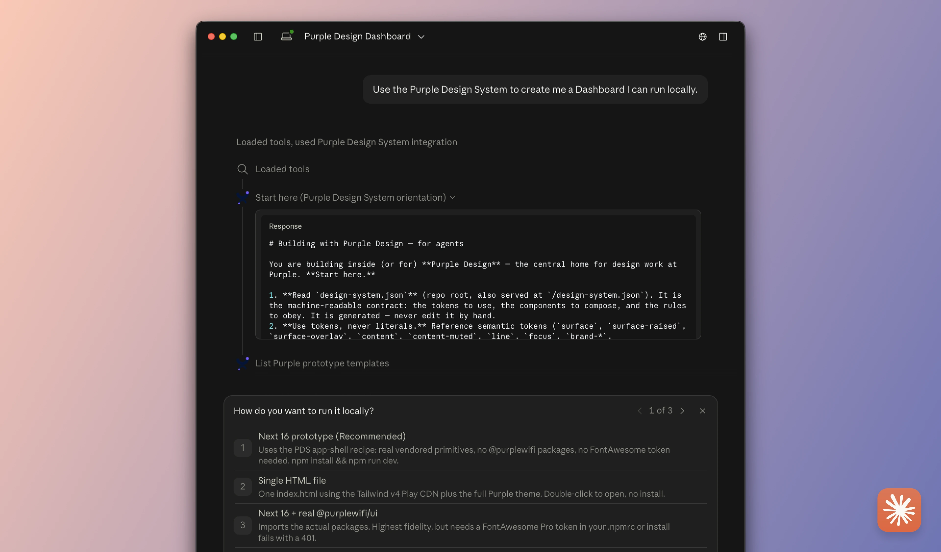
The system is exposed as a URL. Add it as a connector in Claude Code and ask for what you want: build me a dashboard using the Purple Design System.
It fetches the real packages from GitHub and builds from those. Ask for a template and it uses that one; otherwise the templates decide where the components go. Rules in the manifest, a generated JSON file nobody edits by hand, say where a side navigation lives and where a top navigation lives. When the build finishes, the MCP runs the validation and checks its own work.
What it has done so far
More than 2,000 successful calls in the first month. The days a week we lost to reviewing other people's prototypes came back.
The design team governs the look without making the prototypes, which matters when most of the people making them sit in other teams. If someone needs a component that does not exist, I build it, push it to the packages, and they have it.
Work that ran to months on a large project and weeks on a small one now takes hours.
What I learned
Live packages are the whole thing, not a detail. The first version of the MCP built from an imprint of the system instead. It followed every rule, it looked right, and it was frozen. Anything made that way would have fallen behind the moment the system moved on, and nothing in the output would have shown it.
The packages now check for a newer version on every build. The snapshot route is still there for anyone who cannot connect, and a handful of people still take it, which is the original problem in miniature. The system is also only weeks old, so the numbers are early and nothing has been through a full product cycle yet.